This is a guest post by Aaron. He also wrote a cool one on the 1940 U.S. Census.
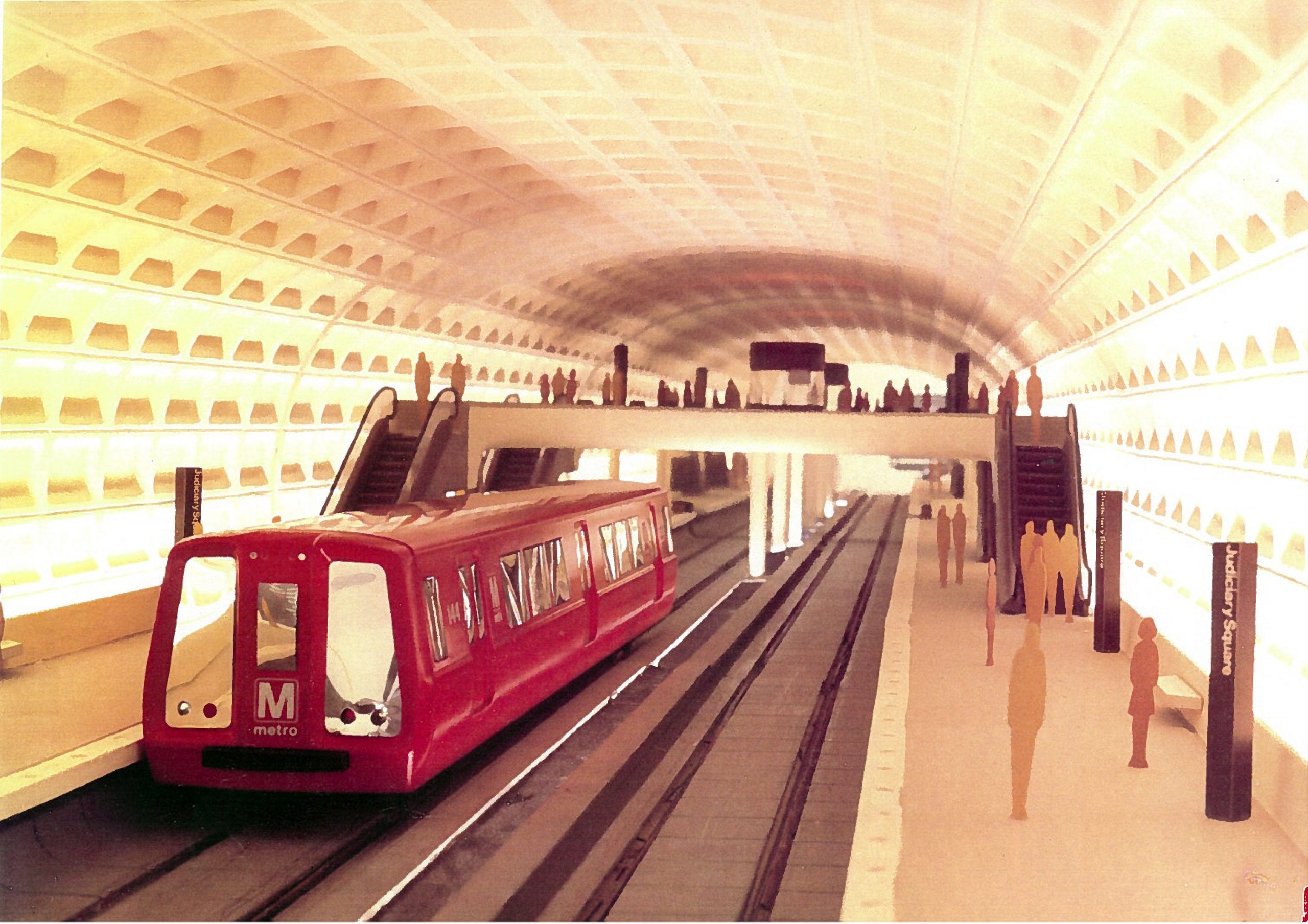
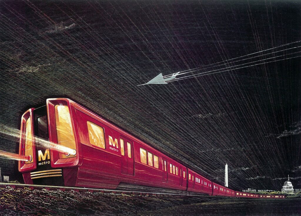
We suspect you’ve ridden Metro for many years – without seeing anything quite like these stunning “glossy red” train cars. They were part of the original plan. Sure they’re sleek and sporty but they never progressed beyond the drawings and models seen here. Why not? And where did this space-age mockup come from?

We’ve stumbled upon a treasure trove of old Metro plans. We’ll share the most fascinating images and stories in the coming weeks. Today we’re focusing on those bright red train cars. They were directly inspired by subway cars spotted in London in the mid-1960s. It’s a great story – but let’s quickly cover some basic Metro pre-history.
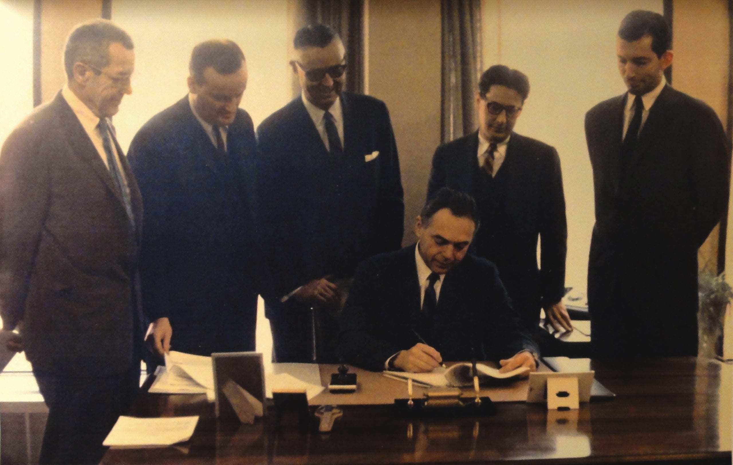
Metro opened in 1976. Subways don’t appear overnight. Planning started in the 1950s. We all know and love WMATA but we may not be familiar with it’s predecessor, the National Capital Transportation Agency. NCTA and the District’s Commission on Fine Arts called the shots as Metro came into being. They picked Chicago-based Harry Weese & Associates (HWA) as the system’s architect.
London and Berlin

Weese and his team traveled the globe in a whirlwind survey of subway systems. It was March 1966, just days after the architect signed a contract to design Metro. The HWA crew visited 18 city subway systems in 42 days. Each yielded new insights. They came away with subway maps, photos, and very extensive notes.
Quick sketches from Bob Reynolds, HWA’s design leader for the project, show early concerns for stations, trains, and riders. They note materials, color, light, pedestrian flow, escalators, signage, and staff uniforms.
When they first visited London, the HWA team noted brightly colored stations and trains:
“[Train cars] painted red were especially attractive. The cars had groved [sic] wood floors, luggage racks and side seating. Smoking was permitted in certain cars.” -Notes of Stanley Allan, HWA Metro project manager, April 1966.
Weese’s contract required the architect to present design concepts for “transit vehicles.” A second trip took HWA staff back to London and Germany in summer 1966 to meet officials responsible for the design and upkeep of train cars:
“We were particularly impressed by the painted exterior of the trains. The beautiful Berlin chrome yellow was our favorite, as was the English red used for so many London trains. We subsequently selected a bright, glossy dark green color for Washington.” -Stanley Allan, 1994.
Red, Green, or Colorless

Green trains? It’s hard to find any more discussion of that color option. By 1967, top members of Weese’s staff moved from Chicago and opened an office on K Street. They adopted “elements of continuity” to guide their design work as the project grew in scope and complexity. Metro’s color palette was a key part of that framework. They returned to red:
“We recommended the color of the trains would be a glossy red, like the ones we admired in London, Berlin, Moscow and Tokyo. Against the otherwise muted background of the stations the red trains would offer a dynamic and exciting movement of color to the station environment, in addition of [sic] the clothing of the patrons.
This idea was denied with a decision to avoid the painted approach, with all of its alleged costly maintenance problems and the need for a paint shop at the yard.” -Stanley Allan, 1994.

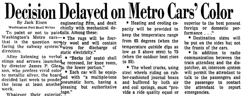
NCTA became WMATA and the board’s chairman, James P. Gleason, was particularly fond of the bright red design. HWA’s conceptual notes were handed to Carl Sundberg, the Detroit-based industrial designer who would craft the train car exteriors. Sundberg wasn’t a fan of paint. The Post covered the ensuing color clash in May 1970:
“The visual elements were incorporated into the full-size mockup of a car that was put on public display in 1968. That car is silver with a wide, dark-gray horizontal strip bracketing the area of the tinted windows and a narrow red strip near its front end.
When the mockup was ordered, Gleason insisted that a smaller painted model also be built. It is tomato red – a pleasing contrast, Gleason insisted, to the ‘rather sterile’ concrete color of the arched station roofs.
‘You know, people don’t buy aluminum (colored) automobiles,’ Gleason told his colleagues. ‘They buy red ones and green ones and blue ones.’
[Sundberg] dissented sharply. It would be a shame, he said, ‘to paint over nice stainless steel or aluminum.’ Besides, an associate added, painting would cost $9,000 more over the life of each car.” –Washington Post, 5/11/1970
You know how this story ends. Cost concerns killed the sporty red Metro car. When trains started rolling on March 27, 1976 they were as they are today: unpainted aluminum.

This GoDC guest post was written by Aaron. He has a few more stories on Metro’s early plans lined up – and he still has a stack of books checked out of the library. Anything you’ve been wondering about Metro’s original plans? Ask in the comments or contact Aaron.
Forget the red cars, they should have stuck with the bright lighting they demo’d in that 1968 model. Sure it’s cheaper to have a dimly lit platform but they feel like mausoleums.
Can I get a print of that red train sketch? I find it awesome.
I think Metro should paint four cars in this special livery and send them around the tracks as part of a PR exercise, to celebrate the system’s anniversary.
Four bright red painted cars would even be something to look out for on the rides; it would make the journeys a bit more interesting. And I think riders would love the concept of a special car or four.
Agreed. I bet a brighter station would make people feel better about the system in general and less apt to complain.
I have nothing against the idea of the red trains, but I will put in a word in favor of the stainless steel. It was a fine match for the sleek space-age design of the system overall. True, the red would have been a splash of color in the cool grey stations, but in the stainless cars that function was performed by the interiors, in the original bright oranges, took on that role. If anything, I think it was the choice of brown as the secondary exterior color that was misguided.
Anyone else find it disconcerting that, in this “space-age” mock-up, the Metro was paired up with the ill-fated Concorde – which suffocated to death under the weight of its operational costs and local opposition?
Not the concord, nose and tail are wrong. Just another “futuristic” delta winged plane.
err… “Concorde” (sp)
You can download the image. It’s high resolution.
Red, aluminum, whatever. Metro still needs to put a bar car in every 8-car train. REVENUE STREAM, PEOPLE!
Who cares about the paint jobs? What I care about is the 3 to 1 ratio of Orange (Vienna) to Blue trains (Franconia) EVERY SINGLE evening during the rush hour commute. Usually THREE orange line trains (the third one is practically empty) coming one after the other — then and only then will a 6 car Blue line Train come along– only to be packed to the gills by the time it reaches Farragut West.
And the Concorde never took off from Reagan National either.
IIRC, the only time WMATA has done ‘special cars’ was when McDonald’s paid to have a few of them completed ad wrapped.
IIRC, some of them also sported side panel displays, similar to their bus counterparts. (I’d hate to think of what could happen if one of those peeled off in a tunnel!)
If you look at the angle of descent, the SST was probably heading towards Dulles, to meet up with the Metro train there. 😀