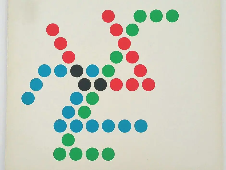
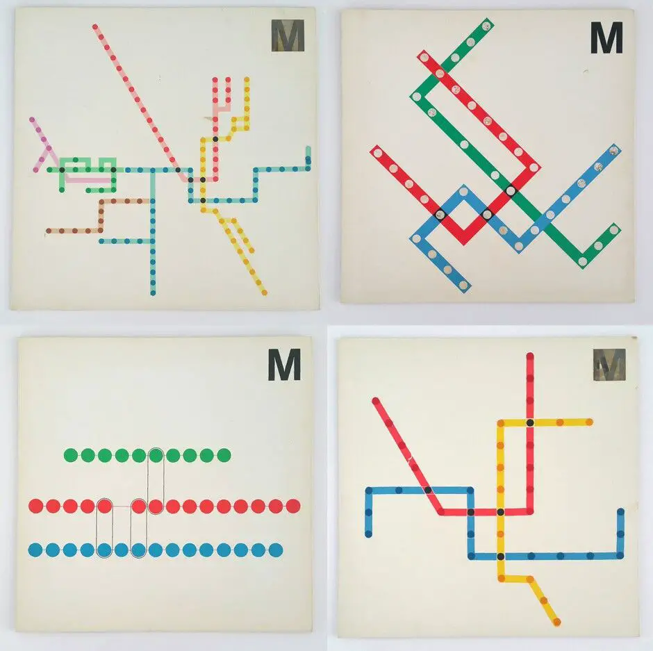
When you think of the Washington Metro, what comes to mind? Perhaps it’s the distinctive brown pylons that mark the entrances to the stations, or the clean, simple signage that guides you through the system. These iconic design elements are the work of Massimo Vignelli, an Italian designer whose influence on the Metro cannot be overstated.
The Early Years
Born in Milan in 1931, Vignelli was a true Renaissance man of design. He trained as an architect but worked across a wide range of disciplines, from graphic design to interior design to product design. His work was characterized by a bold, minimalist aesthetic that emphasized simplicity, functionality, and timeless beauty.

Shaping the Washington Metro
In the late 1960s, as the Washington Metro was just beginning to take shape, Vignelli was brought on board to help create the system’s visual identity. He proposed a series of towering brown pylons, featuring the Helvetica font, to mark the location of each Metro stop. These pylons quickly became a symbol of the Metro itself, and remain an iconic part of the Washington landscape to this day.
But Vignelli’s influence on the Metro went beyond just the pylons. He is also credited with suggesting the name “Metro” itself, bringing the system in line with the naming conventions of other major city subway systems around the world. And his philosophy of timeless, functional design guided the entire look and feel of the Metro, from the signage to the maps to the stations themselves.

The Evolution of Vignelli’s Vision
Of course, the Metro has evolved over the years, and not always in ways that Vignelli approved of. In the early days, the stations were designed with minimal signage, relying almost entirely on Vignelli’s pylons for wayfinding. But as the system expanded and ridership grew, the Washington Metropolitan Area Transit Authority (WMATA) began adding more and more signage to the walls of the stations, much to Vignelli’s chagrin. In 2010, he famously criticized these changes, calling them “pollution” and arguing that they detracted from the clean, uncluttered look he had originally envisioned.
Despite these changes, however, Vignelli’s influence on the Metro remains profound. His pylons, with their distinctive brown color and Helvetica lettering, are still the most recognizable symbol of the system, and his emphasis on simplicity and functionality continues to guide the Metro’s design to this day.
A Legacy That Endures
But Vignelli’s impact goes beyond just the Metro. Throughout his long and varied career, he worked with some of the biggest names in business, from IBM to Bloomingdale’s to American Airlines. His designs for these companies helped to shape the way we think about corporate identity and branding, and his influence can still be felt in the world of design today.
At the heart of Vignelli’s work was a deep belief in the power of design to shape our lives for the better. He once said, “If you do it right, it will last forever,” and his work on the Washington Metro is a testament to that philosophy. By creating a system that is both beautiful and functional, that is both timeless and innovative, Vignelli helped to make the Metro an integral part of the fabric of Washington, and a model for transit systems around the world.
So the next time you find yourself riding the Metro, take a moment to appreciate the work of Massimo Vignelli. From the pylons to the signage to the very name of the system itself, his influence is everywhere, guiding us and shaping our experience of the city. It’s a testament to his skill as a designer, and to his enduring legacy as one of the great visionaries of the 20th century.